A brand that doesn’t hit snooze.
Rise and Wake
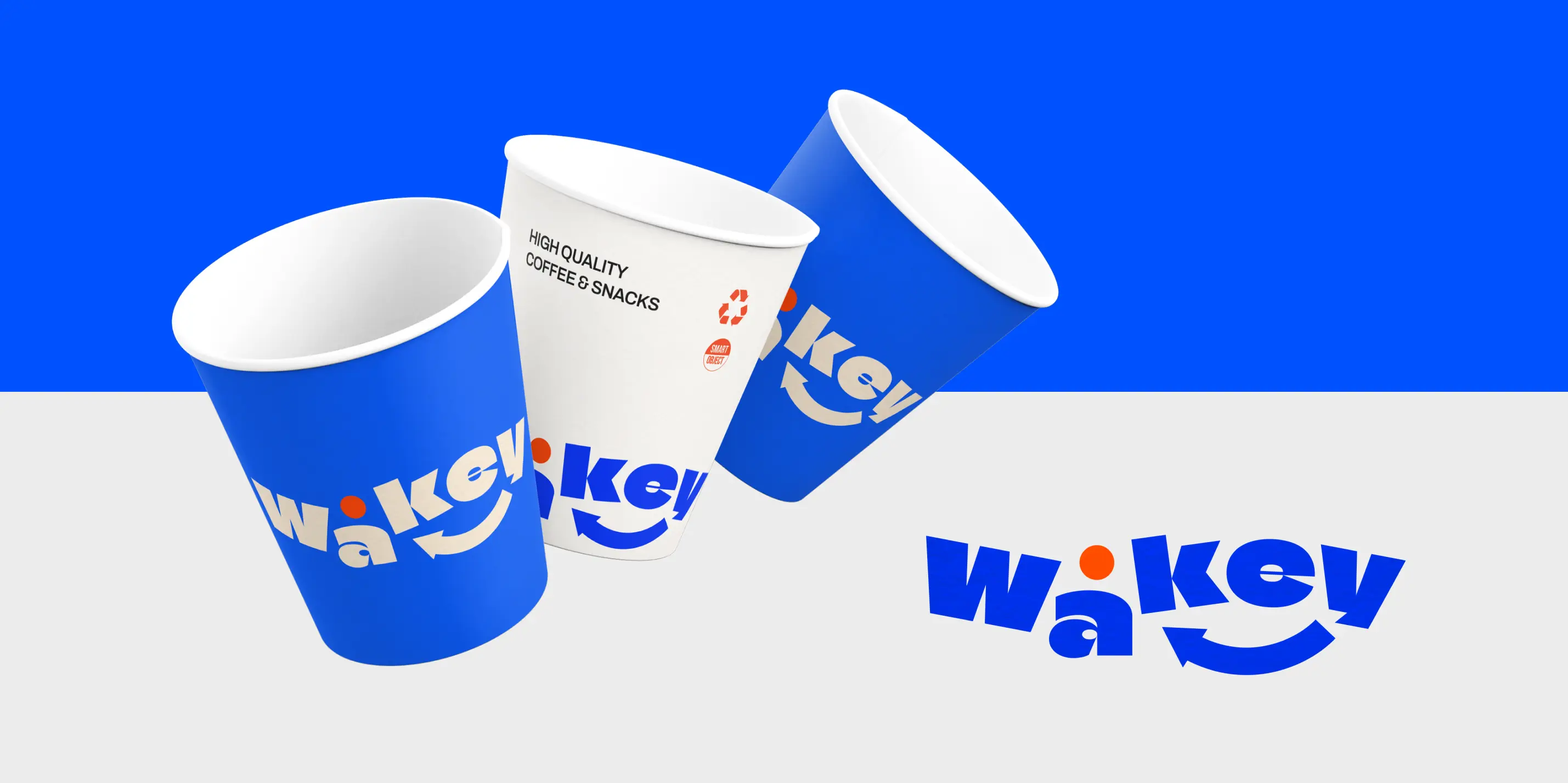
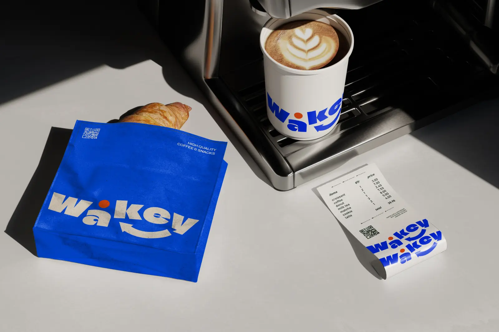
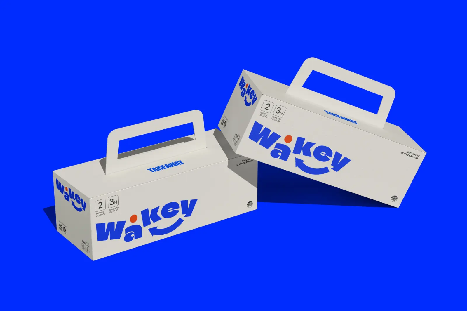
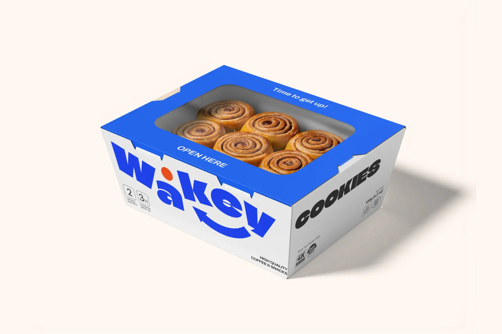
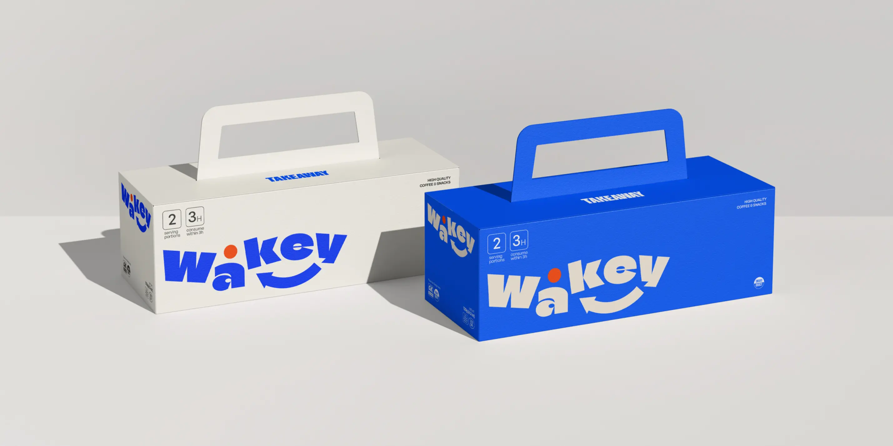
Wakey is a contemporary coffee brand designed around one simple promise: lift. Inspired by the expression “wakey wakey,” the identity translates the feeling of activation into a strong, graphic visual system. The logotype integrates an ascending arrow that symbolizes the boost that comes with the first sip. The typography is bold, rounded and highly recognizable, balancing playfulness with structure. A vibrant electric blue dominates the palette, contrasted with white and a sharp orange accent that injects warmth and energy. Across cups, takeaway packaging and in store applications, the system remains cohesive, confident and instantly memorable.
Energy in Motion
The result is a distinctive brand world that feels optimistic, modern and full of momentum. From packaging to physical touchpoints, Wakey communicates clarity and forward movement. A brand designed to visually reflect what coffee does physically: it wakes you up and pushes you forward.
.webp)